Lucas

sanjacinto
Mt. San Jacinto
  1. Cappuccino Index Claim Significance

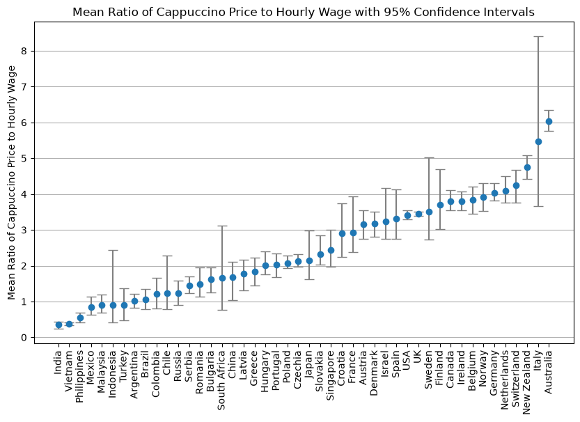
    In a new James Hoffmann video on the cappuccino index, he surveyed his audience asking baristas to report the country they live in, cost of a cappuccino, and their wage. He used the average number of cappuccinos a worker can buy with one hour of wages as the index. Then compared indices to support some hypothesis. I wanted to test the comparability of the countries. Specifically Italy and Australia because James referenced them. So, I started by bootstrapping the samples and plotting the mean and 95% confidence interval, shown below.

    all significant comparisons
    Italy stands out as having the most uncertain estimate. The sample means could really span a wide range. To see if Italy can be compared to the countries closest to it in the ranking, I bootstrapped a pairwise test by sampling the difference between Italy and each other country below

    Italy's significant comparisons
    The grey x's show the countries that are not significantly different from Italy (in black).

    Given his data, we really cannot confidently claim that Italy has the second highest index. To make a more robust dataset one would need to have more confident samples.

    Number of samples per country

  2. Gene Expression Level site

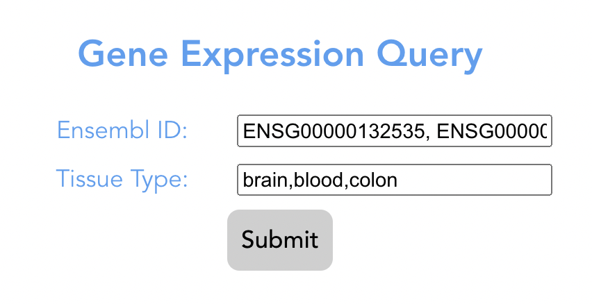
    A microservice useful for comparing gene expression across various tissues.

    Here is a link to the website

    Mosaic microservice front page
    Mosaic microservice app graph

    It queries Open Targets to get the normalized TPS values for your gene, sums them, then divides them by sum total of all TPS values for the gene.

    I used Vue.js and Java (SpringBoot/Webflux).

  3. Pomodoro Timer App

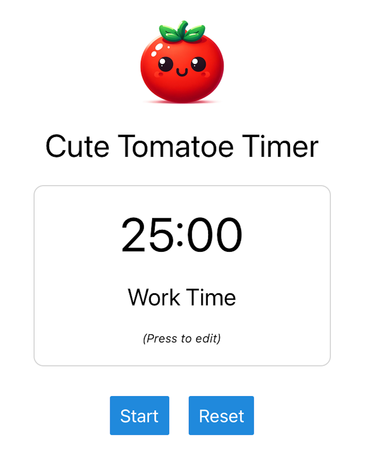
    Picture of my Pomodoro timer app

    I have a problem at work. When I get locked in, I forget to take breaks. Breaks are great for the body and the mind because they help prevent repetitive stress injuries and increase creativity. To fix this, I created a Pomodoro timer for IOS (and soon to be web). I wanted something very simple, without ads, that would not track me. I could not find anything that satisfied these requirements so I built my own!

  4. Personal Text Analysis

    At the beginning of the year I went through a breakup and did an exploratory data analysis (EDA) of my text messages with this person.

    I was interested in exploring the following questions:

    What illustrative trends can we see to validate that this is normal data?
    Are there observable trends in our messages leading up to the breakup?

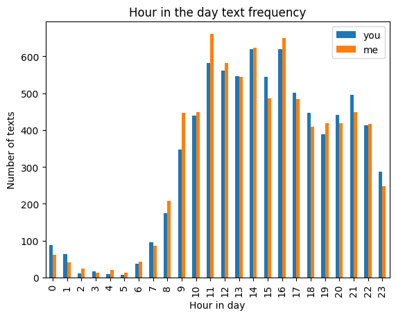
    To answer 1. I plotted the time in day that the texts take place, binned by hour. It shows what you would expect, texts drop in the middle of the night. One interesting trend is that I (orange) text a little more in the morning, and my ex (blue) is more active in the evening. Which is cool to see because I was more of a morning person.
    Picture of texts binned per hour of day.
    This illustrative plot shows that my data is relatively normal, which is good because this analysis may be able to be applied to future data.

    To answer 2. I applied a sentiment analysis algorithm to each text to get the table of positive or negative values for our data. I binned these values by day for each of us, and plotted them. I noticed an increased variability leading up to the breakup (which took place at the far right of the plot).
    Plot of sentiment.
    The next plot is of the variance, binned by week this time, to capture the day to day variability seen in the prior plot.
    Plot of sentiment variance.

    As my ex and I were working through our issues, we would have days where we feel like we are going to make it, followed up by days where we both feel like it's over. The intense switching of positive and negative emotions can be seen in this data! This was so cool for me to see and is one of the reasons I love data analysis of contemporary issues. You can observe trends that you feel!

    I do have one lingering question. Do these trends express themselves in other breakups? I scoured the internet and unfortunately could not find any ethical data.

    This was a cool project for me and I hope someone could get some value out of it too. :)

  5. organize.monster

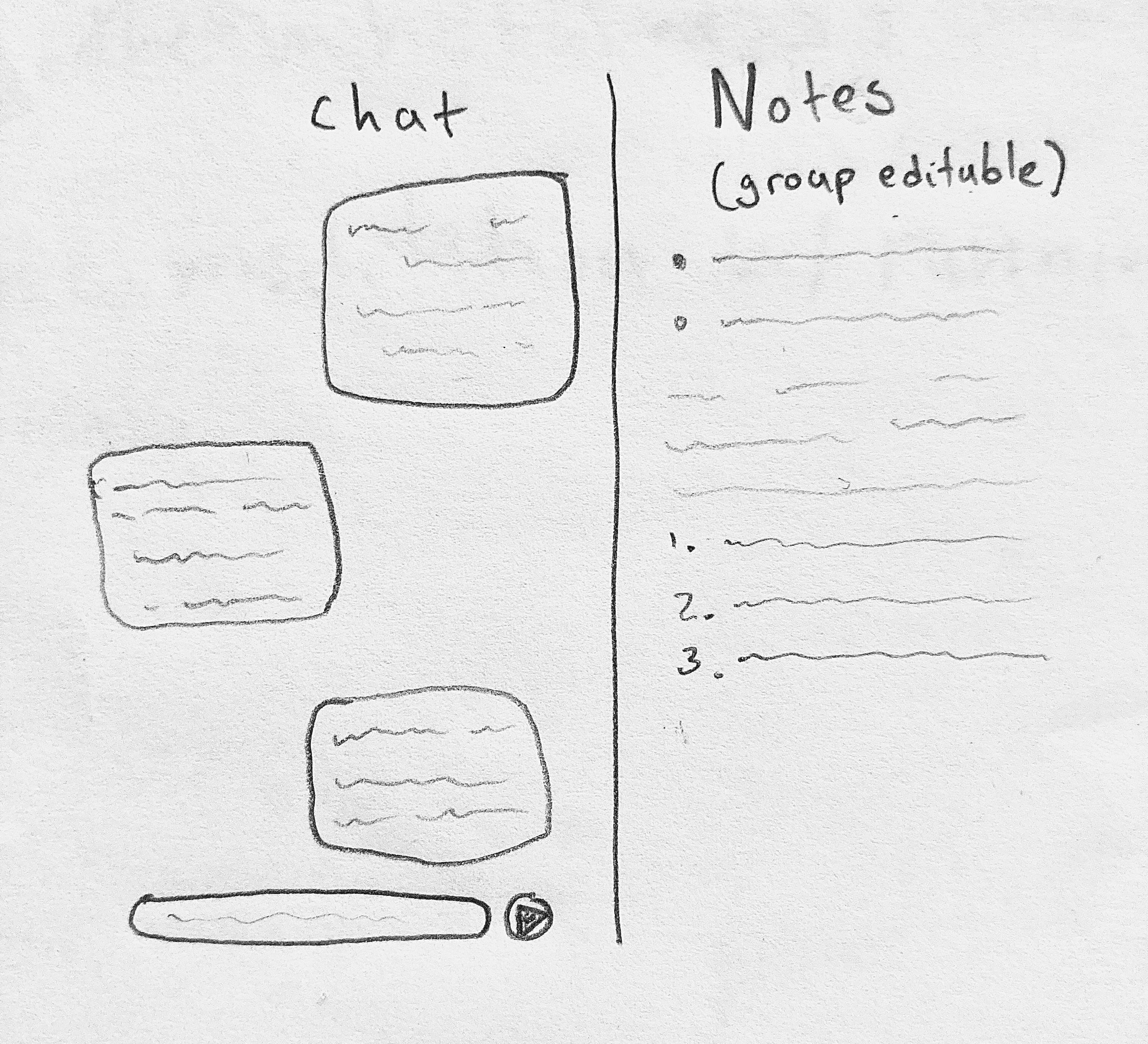
    A chat alongside a collaborative live document. Useful for times when group chats need extra permanence, like during trip planning. Planned tech stack uses: Vue.js, node.js, mongodb.

    Link to prototype

    Drawing of what it would look like

  6. Thebe

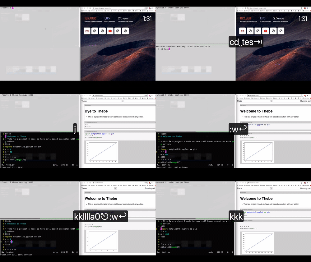
    Thebe is an alternative to jupyter that can be run with any code editor such as vim or vscode. The tech stack is vue.js and flask. Github

    Thebe example gif

  7. IOTA Bet

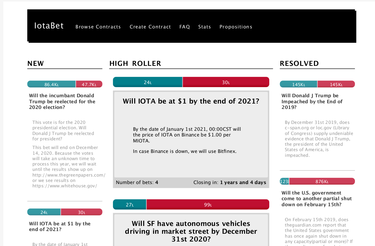
    My partner and I built a web application to facilitate betting online. It would allow users to propose two sided bets, and then users could bet on one side or the other. We did not release it due to the complex regulatory nature of cryptocurrency and betting.

    Screenshot of the finalized product

  8. This Agora

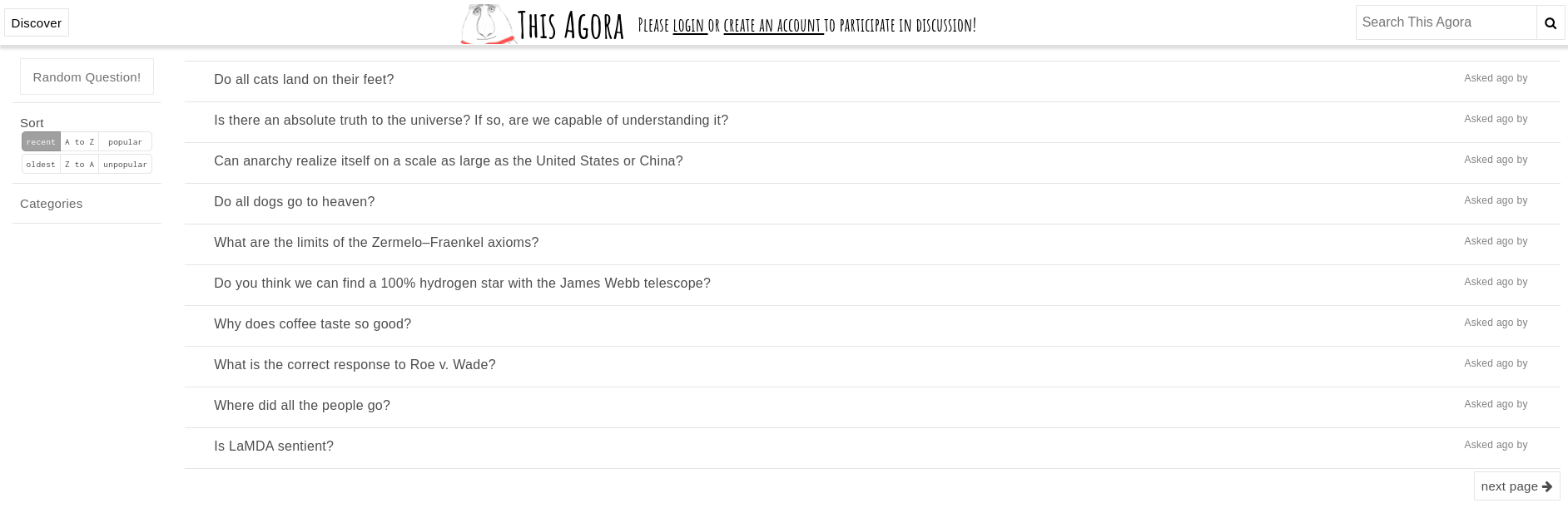
    My partner and I built This Agora to be a bridge between a wikipedia and reddit, but the idea began as a polling site. Link to semi functional site

    Picture of this agora in a semi functioning state

  9. Rat Bird

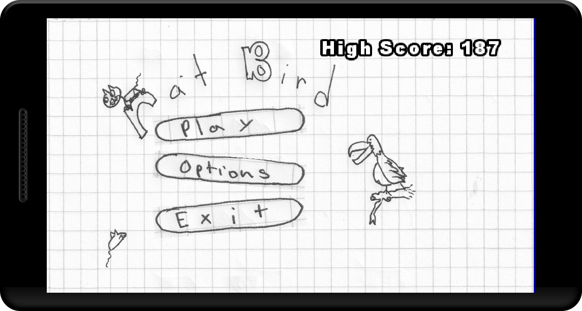
    This is one of my first programming projects after learning to code. It was so fun making the art for it because it was scanned cut-outs of doodles I made on my math homework. The tech stack is Android Java and the GDX game library.
    Github
    Picture of my old game ratbird