
Modelling Irish Hospital Trolley Counts
projectsIreland's Health Service Executive (HSE) publishes a daily count of patients on hospital trolleys, people admitted through emergency departments who don't have a bed and end up being treated in a corridor or overflow ward instead. It's the number Irish news uses to talk about overcrowding. The problem is it's always reported as a raw count, and a raw count is just correlated with the region's population. We wanted to know whether, once you control for population, some parts of the country are actually under more strain than others, or whether the differences you see in the news are just noise.
We scraped the HSE's daily report every day from January 2023 to April 2026, and aggregated counts up to weekly totals for each of Ireland's six health regions. The raw weekly series below already shows a lot going on.
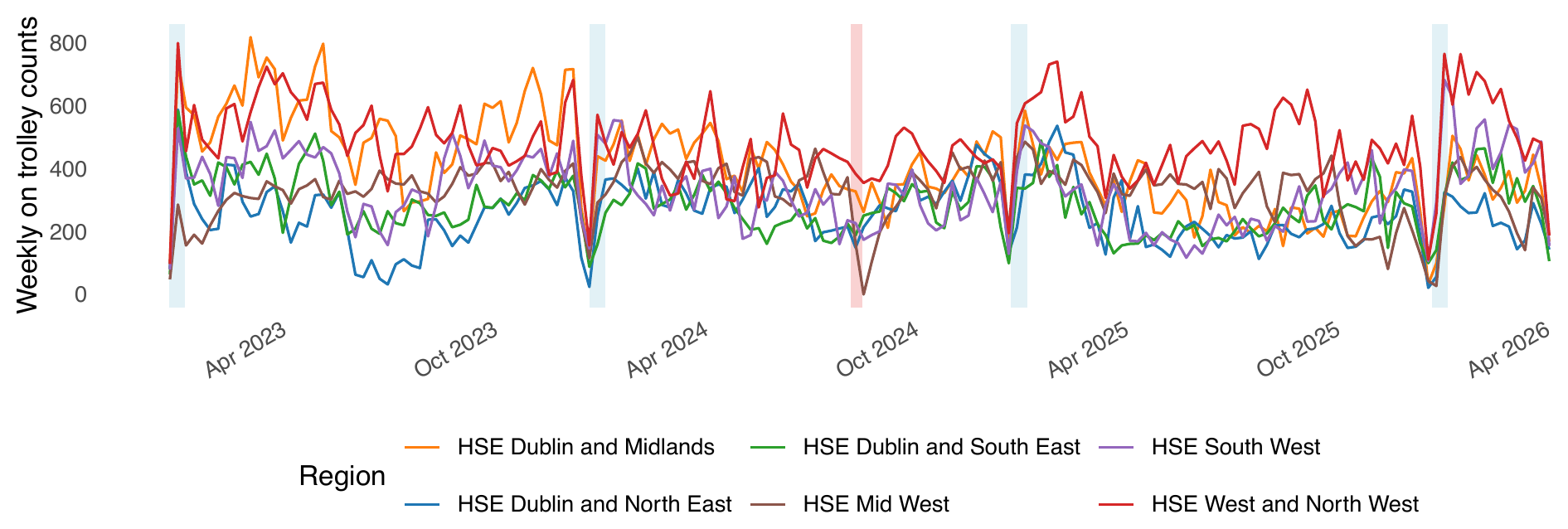
In the plot above, every region has a sharp dip right around New Year, marked in light blue, that lines up with hospitals discharging people over Christmas to clear beds for the January respiratory surge. And there's one dip that only shows up in a single region, HSE Mid West, in light red, in August 2024. That one turned out to be real. Mid West had paused scheduled care that month to deal with an overcrowding crisis, and it shows up cleanly in the data as an isolated drop no other region has. We call this the Mid West reset.
To compare regions properly, we built a Bayesian time series model in JAGS, with a region specific level, a region specific annual cycle, a shared New Year effect, that one off Mid West reset term, and an AR(2) term to soak up week to week persistence. Everything is scaled per 10,000 population so a region isn't penalized just for being big.
The annual cycle term is the most interesting result of all this for me. Research on Irish hospital admissions has found about a 40% increase in respiratory admissions in winter compared to summer. To investigate this in our own data, we modeled the timing of that peak for each region. Most regions do peak in winter, matching that pattern. Mid West is the exception, where the timing is uncertain. Below is the modeled peak timing by region, with winter, December through February, shaded in blue.
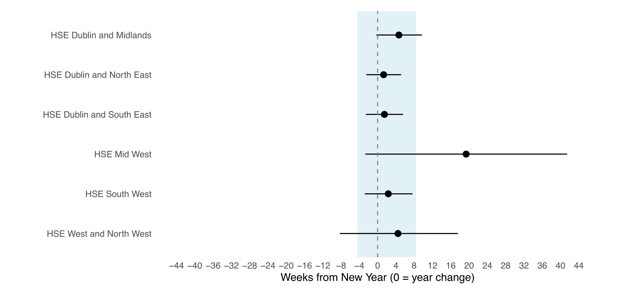
Another key result is what the regional levels look like once you do that, mapped below.
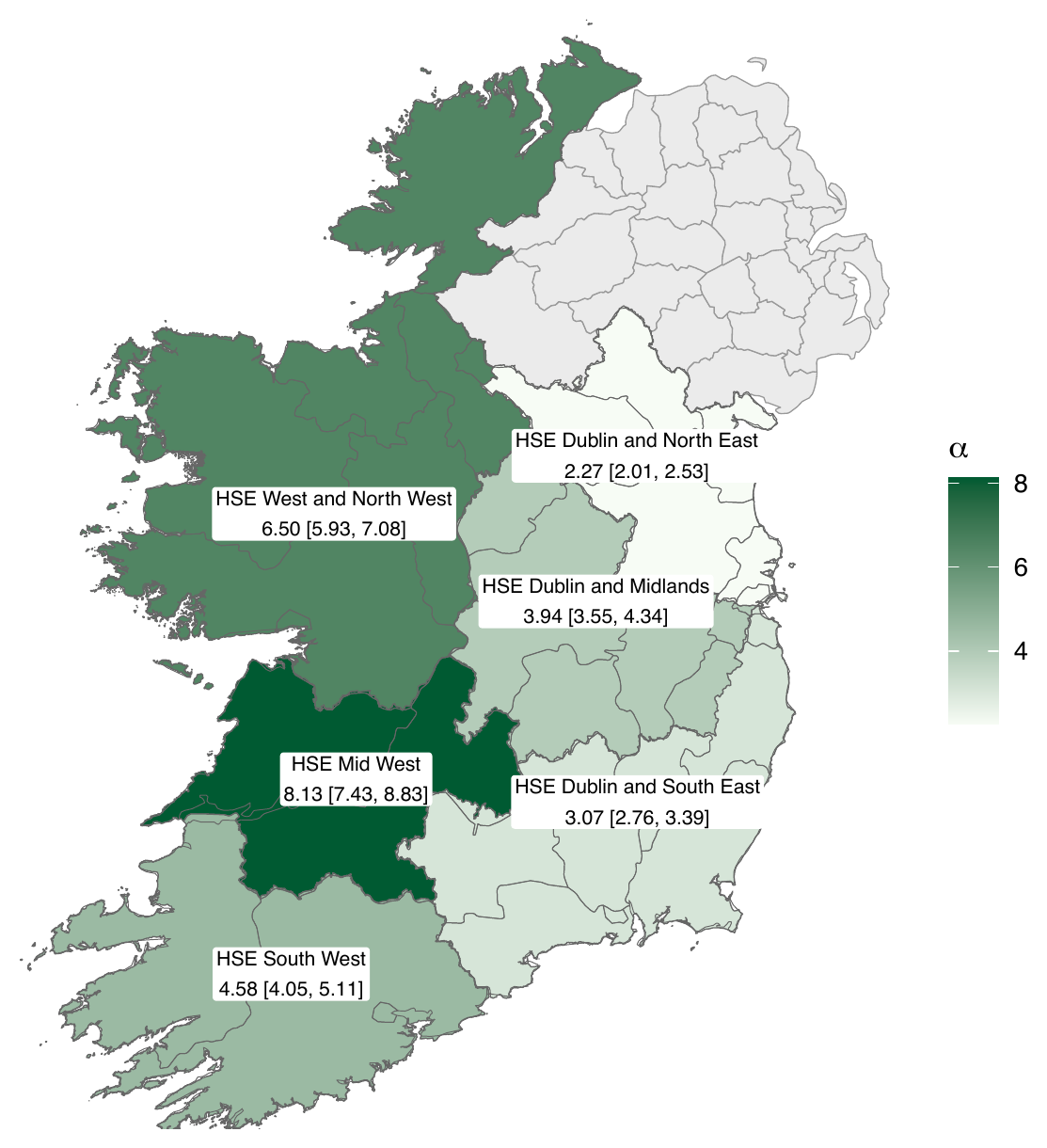
There's a west to east pattern in the map above that holds up statistically too. HSE Mid West runs at 8.13 trolleys per 10,000 population, more than three times HSE Dublin and North East's 2.27, and fourteen of the fifteen pairwise regional comparisons are statistically significant. The three western regions all sit above the three Dublin regions. None of this is visible in the raw totals, where a big population can make a region look worse than it actually is. This is only clear once you standardize on population, which is exactly the point of doing this properly instead of trusting the headline number.
Another interesting part was watching the model recover the shape and size of the Mid West reset. We told it which weeks were affected, since that's public record, but the size of the drop and its recovery came entirely from the data.
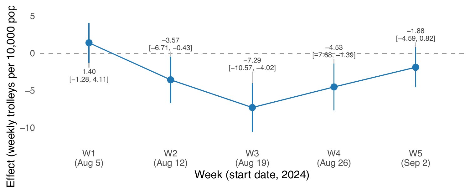
In the plot above, the effect bottoms out the week of August 19th at 7.29 fewer trolleys per 10,000 than the regional level, with a 95% interval that excludes zero, then rebounds back to the regional level by early September. That's a specific, dated hospital management intervention, with its magnitude inferred purely from how one region's data diverged from the rest.
As a sensitivity analysis, we checked the whole ranking against three other ways of scaling the data (per available bed, per euro of regional budget, per over 65 resident), and the top and bottom of the ranking hold up every time. Only the two middle regions swap places depending on scaling, which is a pretty reassuring sign the west to east story isn't an artifact of the specific denominator we picked.
Code and data pipeline are on GitHub, and there's an interactive version of the results at hsereport.ie.